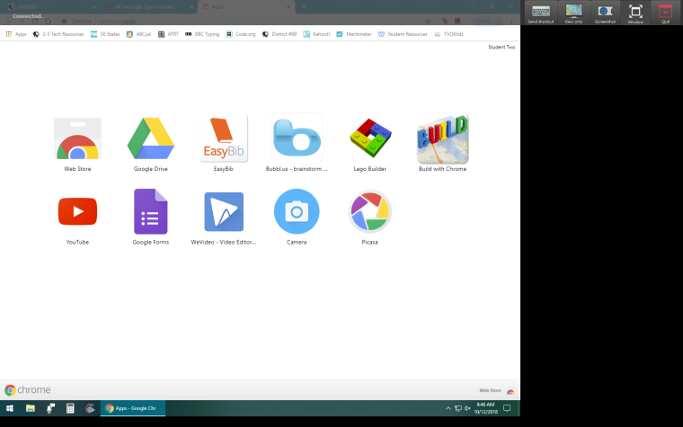
Drop-down menu bar on remote control is annoying!
-
Am I the only one who finds the drop-down bar for the teacher (when remote controlling a student computer) annoying? It's at the top of the screen, and interferes with opening/closing tabs/windows, etc on a student machine, as it drops down every time I move the mouse to the top of their screen for any action (like closing a window or tab on a browser, etc). I'd love to see a way for that bar to be moved to the side rather than at the top. Anyone else?!

-
Yes I agree with this. It's one of my very few complaints with Veyon.
I think it would be better if the menu was consolidated to be much smaller so that it didn't cover important things.
Or maybe have a floating circle design menu which you can move around which has all the controls you need on it.
-
Today I worked on improving this so in upcoming 4.1.5 release the toolbar only appears after a delay of about 500 ms and the animation for appearing/disappearing is much faster now so everything should be much more usable now. A test build (4.1.4.10) is available at https://github.com/veyon/veyon/releases/download/v4.1.4/veyon-4.1.4.10-win64-setup.exe If you like the improvements please consider to make a donation to the Veyon project, see https://veyon.io/get-involved/ for details
